HAVBLINK HVIDVIN

BRANDING & WEBSITE DESIGN
1ST SEMESTER PROJECT

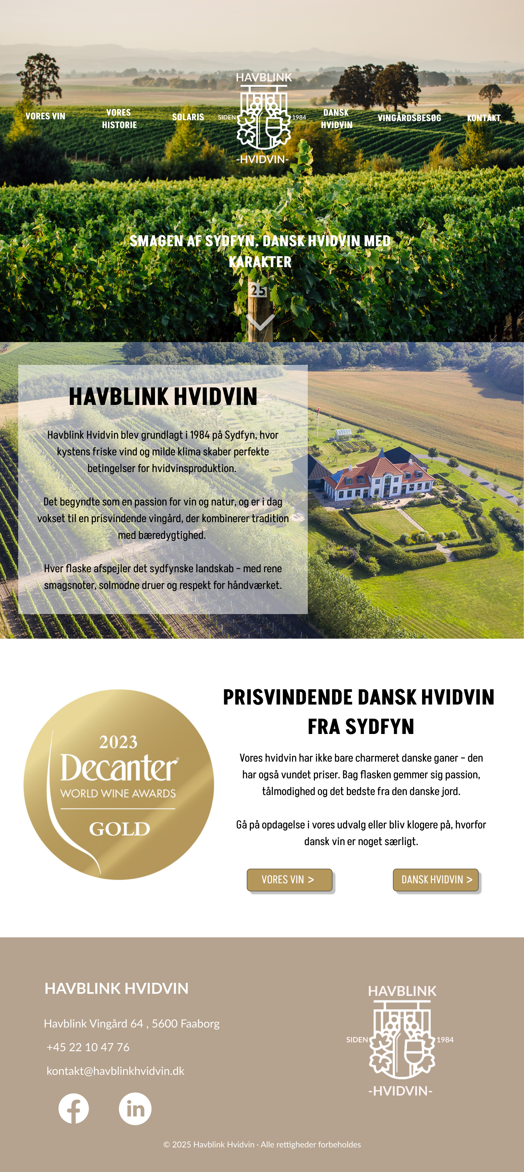
Havblink Hvidvin is a fictional wine brand created during my 1st semester, where I worked with both branding and web design from concept to final result.

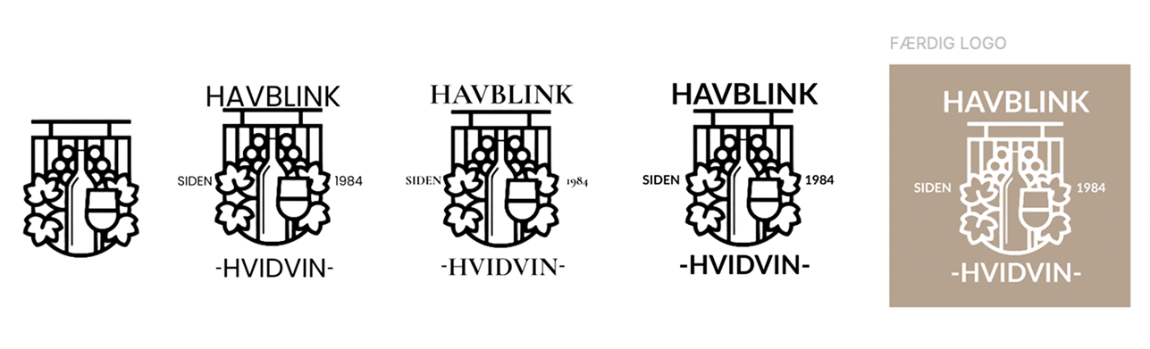
The project included developing a full visual identity, including logo design, style tiles, and a complete website concept presented through detailed mockups. I focused on creating a clean and modern layout that still reflected the traditional and authentic feeling often associated with wine brands.

The mockups were designed in Figma and used to plan the structure, layout, and user flow across the different pages. This allowed me to explore how the brand could be presented visually, from the landing page to product sections and informational pages, while keeping a consistent design language throughout.

The goal was to create a cohesive digital experience that communicates quality, tradition, and local production. Through the mockups, I was able to experiment with typography, color balance, and content placement before development, which helped me understand how visual decisions shape the overall user experience.
VISIT THE SITE
Havblink mockup

MY ROLE AND TOOLS

During this project, I was responsible for the entire process from concept to final website. I worked independently on research, visual identity, layout design, and development, which gave me my first experience handling a complete design workflow.

Figma

FIGMA

I used Figma to create wireframes, structure the layout, and design full-page mockups before development, helping ensure a clear and consistent user experience.

Visual Studio Code

VISUAL STUDIO CODE

Visual Studio Code was used to build the website using HTML and CSS, where I translated the designs into a responsive and functional layout.

Adobe Creative Cloud

ADOBE CREATIVE CLOUD

I also used Adobe Creative Cloud tools to support the visual identity, including working with graphics, logo elements, and visual assets used throughout the site.

VISUAL IDENTITY

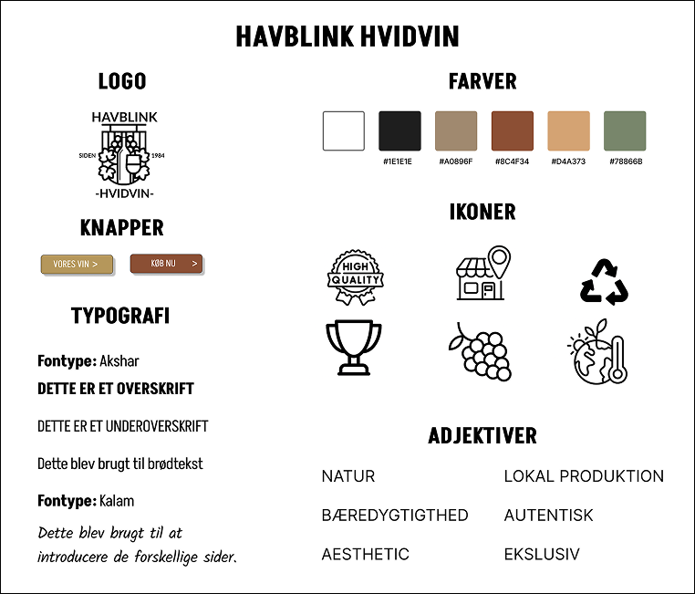
Havblink visual identity board

To create a strong and consistent brand, I developed a visual identity built around themes of nature, authenticity, and local production.

The color palette uses warm, earthy tones combined with soft greens to reflect the natural origin of the wine.

Typography was chosen to balance structure and personality, supporting both readability and brand character.

The goal was to create a clean and elegant look that feels premium without being overly complex.

Thomas

WHAT I LEARNED

Working on Havblink Hvidvin gave me my first real experience creating a complete visual identity and website from the ground up. I learned how branding, layout, and structure work together to form a cohesive digital experience and how important it is to keep a consistent visual direction across all pages.

By developing wireframes, style tiles, and full mockups in Figma, I gained a stronger understanding of planning, visual hierarchy, and user flow. It taught me how to think more carefully about how a visitor moves through a website and how design decisions can guide attention and create clarity.

This project built a solid foundation in both branding and web design, and helped me become more confident in turning an idea into a finished, structured digital product.